Day 14: A World Map
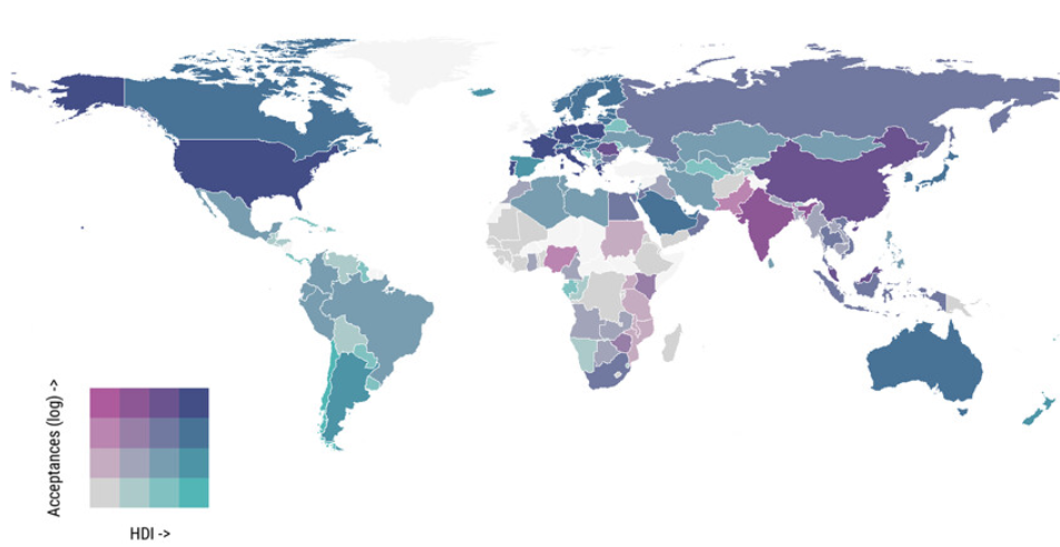
My own research tends to not be at the global scale, however, I am fortunate to supervise some clever PhD students who have led work that I have co-authored. This map was created by Ruth Neville and shows the relationship between the number of accepted undergraduate university applications (log) from an origin country relative to its human development level (2009–2019). The map is shaded using a bivariate colour scheme.

The paper shows that the number of international students coming to the UK is linked to how developed their home countries are, but this relationship isn’t straightforward. The data shows that student numbers increase with the development level, but not linearly. Most students come from countries with mid to high levels of development (around 0.7 to 0.9 on the human development index). Interestingly, there’s a slowdown in student numbers from countries at the higher end of medium development, which could mean fewer students applying or being able to come from these emerging markets.
The map shows that most students come from highly developed countries like the USA, France, Germany, and Poland, as well as China, which has a high development level. India, at a medium development level, also sends many students, and even Nigeria, with a lower development level, showed relatively high student flows. It suggests that while the UK mostly attracts students from well-developed countries, there are exceptions where countries with different development levels send more students than expecte
Full details can be found in this paper:
Neville, R., Rowe, F., & Singleton, A. (2024). Nonlinear relationships between human development and international student mobility: The prominent role of employment prospects and cultural and linguistic ties. Population, Space and Place, 30(5), e2764. https://doi.org/10.1002/psp.2764