Day 21: Conflict
This was the last bit of work that I completed as a postdoc before moving to Liverpool as a Lecturer, and was coded by Oliver O’Brien just after I moved.
The Home Office’s police.uk data website, launched in 2011, and aimed to increase transparency by providing street-level crime data in the form of interactive maps. Crimes were plotted as points (or “pushpins”) on a map interface, initially using Google Maps and later adopting OpenStreetMap. While this initiative was applauded for its openness, it faced significant criticism for its representational accuracy.
The core issue lies in the “pushpin” approach was that crimes are aggregated into single points that appear to indicate exact locations on a street. However, to protect privacy, the real locations are obscured, leading to misinterpretations. Users might assume these points indicate precise crime spots, which can amplify fear or misunderstandings about patterns of crime.
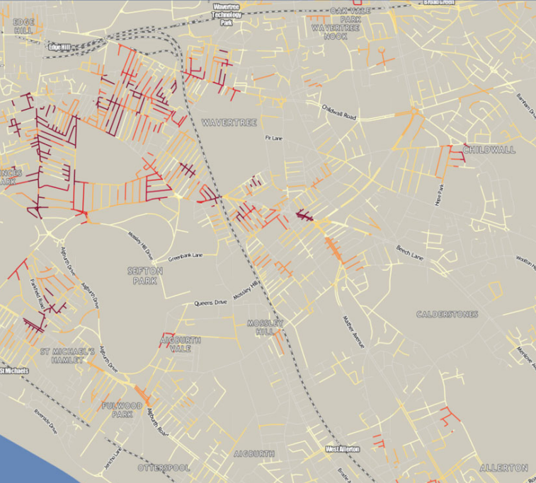
In this paper we developed an alternaive solution that used street networks to map crime data. By attributing crimes to streets rather than arbitrary centroids, we argued that the representation aligned more closely with how the crimes were reported.
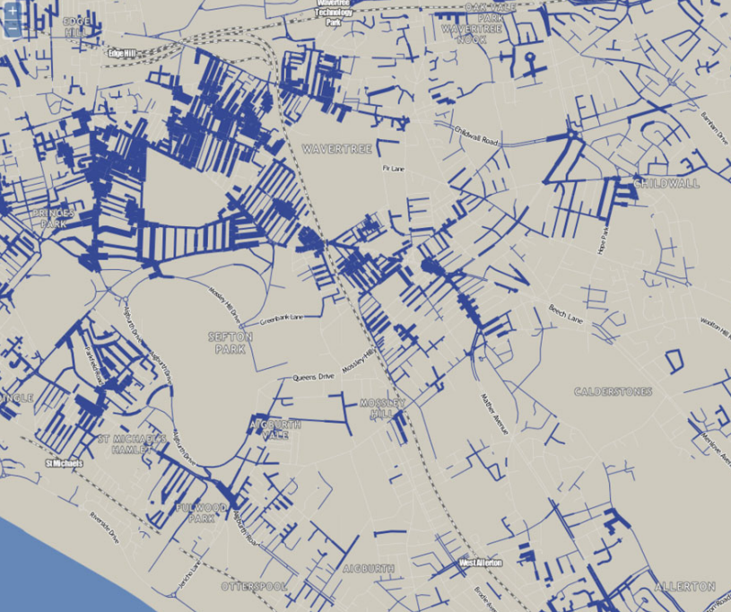
There was a really nice interactive map which is now unfortunately defunct. The visualisation was based on using Thiessen Polygons to select streets around the points where crimes were aggregated.

Which were then use to colour the streets or scale their widths:


Full details can be found in this paper:
Singleton, A., & Brunsdon, C. (2014). Escaping the pushpin paradigm in geographic information science: (Re)presenting national crime data. Area, 46(3), 294–304. https://doi.org/10.1111/area.12116