library(tidyverse)
library(sf)
library(rnaturalearth)
library(rnaturalearthdata)Day 26: Map Projections
An inherent challenge when creating a map is how we represent the earth as a three-dimensional sphere as a two-dimensional surface. For today’s map challenge, I have created as short tutorial that explores a series of different map projections.
Setup Packages
First, we can load the required packages and extract some geographic data:
# Load world map data using rnaturalearth package
world <- ne_countries(scale = "medium", returnclass = "sf")
The Mercator Projection
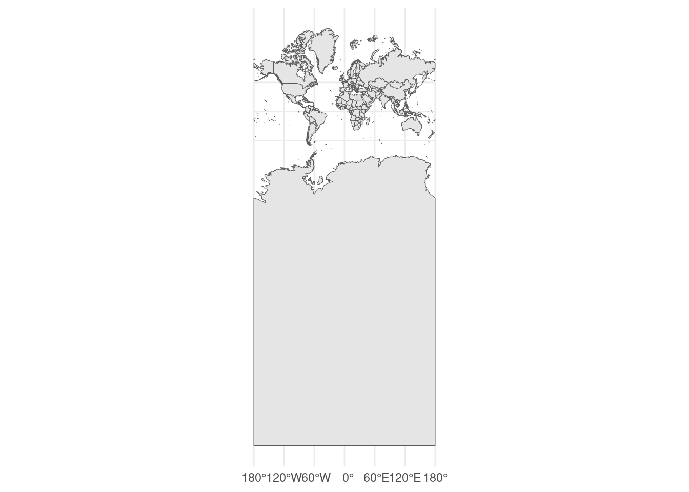
Mercator is a very widely used map projection, and is notably used by Google Maps for its web mapping platform. A world map in a Mercator projection looks is shown below. Notice that there is a quite extreme size distortion near the poles.
ggplot(data = world) +
  geom_sf() +
  coord_sf(crs = 3857) +
theme_minimal() 
The Mercator projection is a [conformal projection] (https://en.wikipedia.org/wiki/Conformal_map_projection) meaning that it is angle-preserving. This makes it very useful for navigation (see this article aboutRhumb Lines). As noted above, it does have quite severe distortion of areas that are near the poles. Visually, Greenland is represented as being almost as large as Africa (Africa is actually about 14 times larger
The Equal Earth Projection
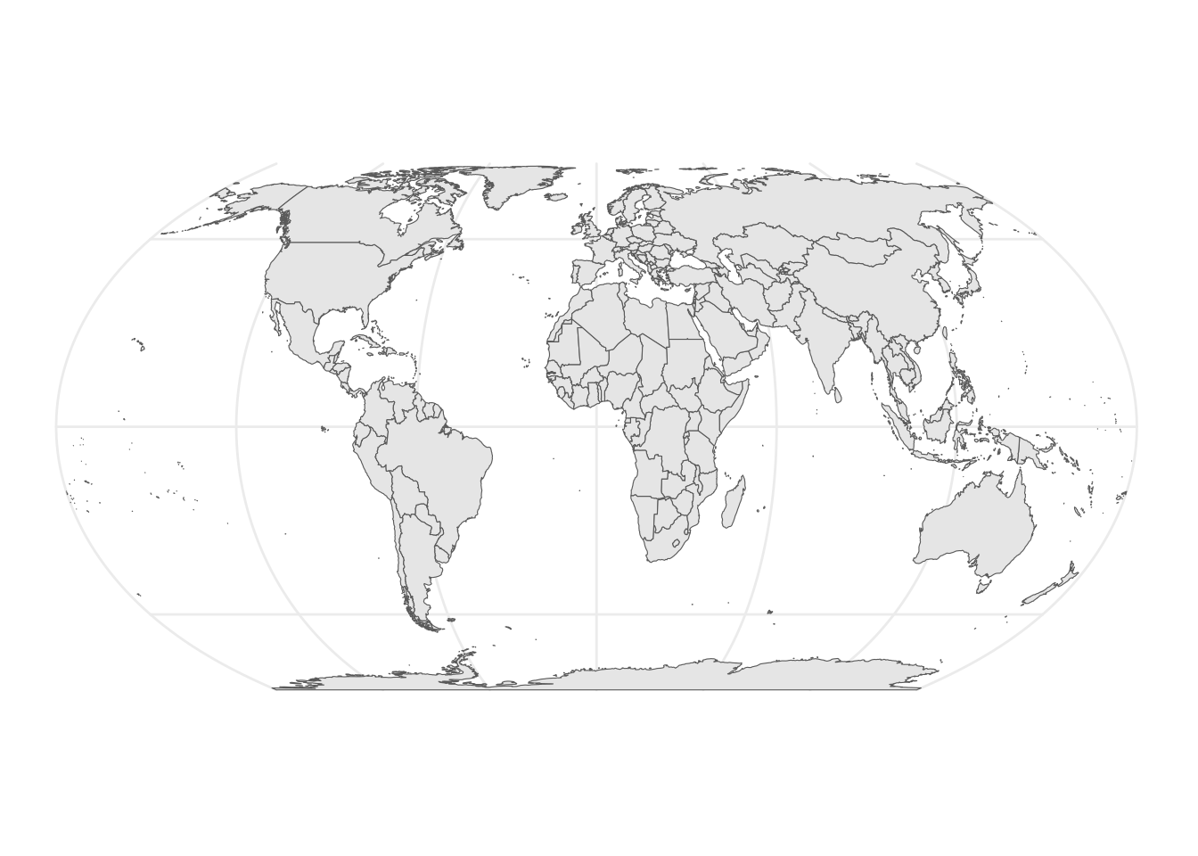
The Equal Earth projection was created in 2018 and aimed to maintain relative size relationships while being visually pleasing.
ggplot(data = world) +
  geom_sf() +
   coord_sf(crs = 8857)  +
theme_minimal() 
The Equal Earth projection maintains accurate size relationships between landmasses, featuring curved parallels and meridians while keeping distortion minimal near the equator.
Comparing Area Distortion
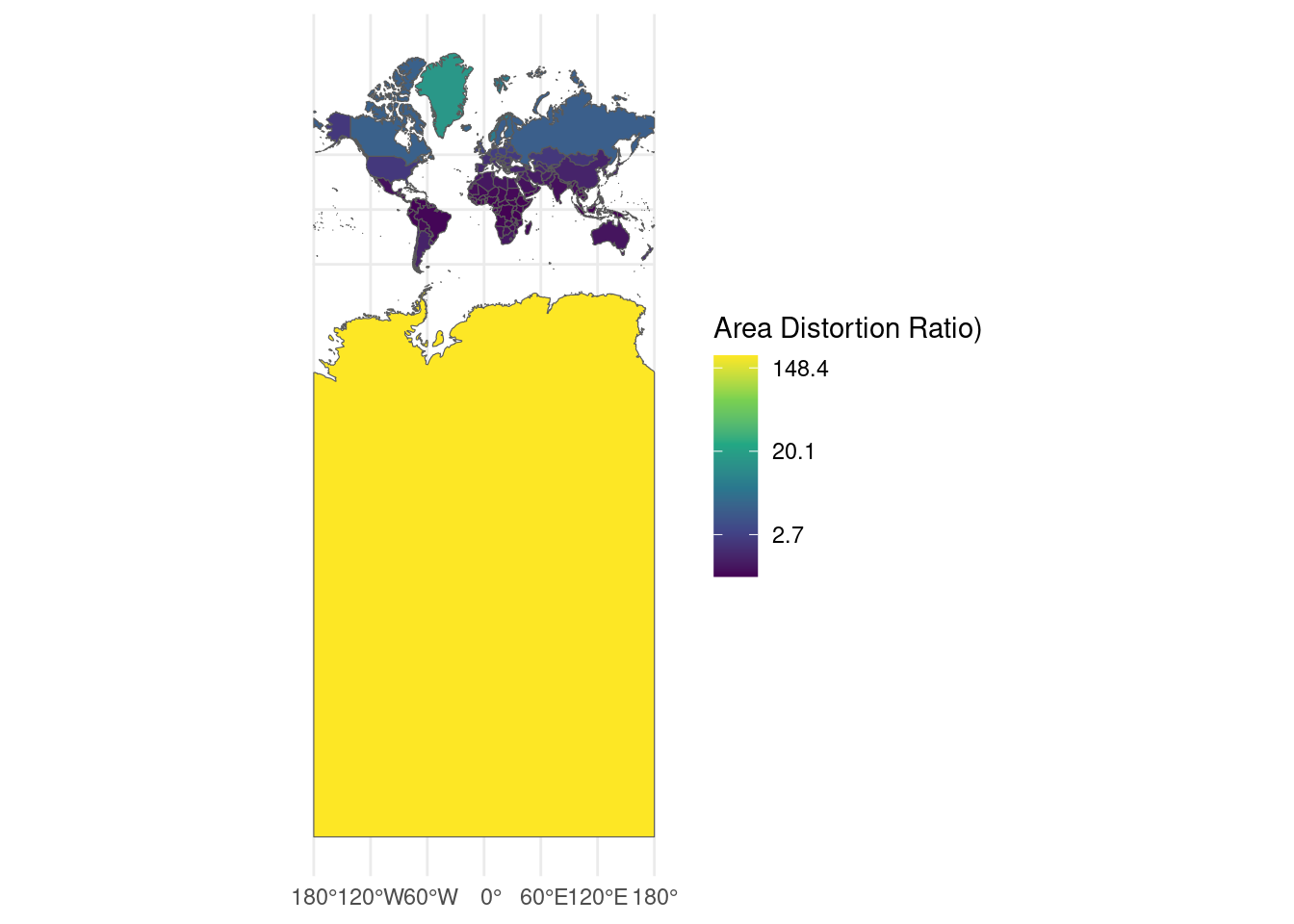
The following function and map aim to visualize relative area distortion for Mertcator.
calculate_distortion <- function(world, projection) {
  # Project the data
  projected <- st_transform(world, projection)

  # Calculate areas
  true_areas <- st_area(st_transform(world, "+proj=eck4"))  # Using Eckert IV as reference
  projected_areas <- st_area(projected)

  # Calculate distortion ratio
  distortion <- as.numeric(projected_areas / true_areas)

  return(distortion)
}

# Add distortion to our world data for Mercator
mercator_crs <- "+proj=merc"
world <- world %>%
  mutate(mercator_distortion = calculate_distortion(., mercator_crs))

# Create distortion visualization
ggplot(data = world) +
  geom_sf(aes(fill = mercator_distortion)) +
  scale_fill_viridis_c(name = "Area Distortion Ratio)",
                       trans = "log",
                       labels = scales::number_format()) +
  coord_sf(crs = 3857) +
theme_minimal() 
This approach is fairly effective, but one of the best visual tools I’ve come across for exploring map projections is The True Size Of. For a full visual explanation of the issues with traditional maps, you can find a great write-up here.